How big is the USA compared to Africa?
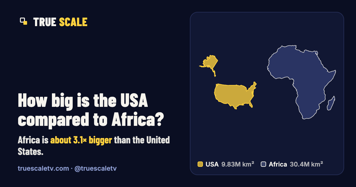
Africa is about 3.1× bigger than the United States.
30.4 million km² (11.7 million mi²) against 9.83 million km² (3.8 million mi²).
- USA 9.83 million km² · 3.8 million mi²
- Africa 30.4 million km² · 11.7 million mi²
Same scale, real shapes: each is drawn in an equal-area projection centred on itself. The bar is 2,500 km (1,550 miles). Small islands of the USA are left out of the drawing; the figures include them.
The numbers
| USA | Africa | |
|---|---|---|
| Official area | 9,833,517 km² | 30,365,000 km² |
| Square miles | 3.8 million mi² | 11.7 million mi² |
| Rank by area | #3 of 235 | continent |
| Main landmass centred at | 40° N | 7° N |
| Mercator inflation | 2.3× | 1.1× |
| Figure from | UN (2024) | Britannica |
By the official figures Africa is 3.09 times the area of the USA, and the USA is 32% of Africa. Mercator inflation is how much bigger the whole outline is drawn on a web map than its real area.
Why the USA looks bigger on maps than it is
Most web maps use the Mercator projection, which keeps shapes but inflates area by 1/cos² of the latitude. The main landmass of the United States is centred near 40° N, where everything is drawn about 1.7× too big; Africa is centred near 7° N, where the factor is about 1.0×. Averaged over the whole outlines, the USA is inflated about 2.3× and Africa about 1.1×.
So on a web map Africa looks about 1.5 times as big as the United States, measured on the same outlines. In reality, the United States is about 3.1× smaller than Africa.
How many times does the USA fit into Africa?
By area, about 3.1 times. That counts area, not a jigsaw puzzle: real outlines leave gaps, so you would have to cut the United States into pieces to fill Africa completely. The difference is about 20.5 million km² (7.93 million mi²).
From our video: Do Russia, the USA and China fit inside Africa?
Russia alone fills about 56% of Africa, and with the USA added the two fill about 89%.
Watch it and the rest of the “Does it fit?” series on YouTube, TikTok or Instagram.
Good to know
- The USA's total (9,833,517 km², UN and CIA) includes coastal and territorial water. Without it the figure is about 9.5 million km² (Britannica), which is why sources disagree on whether the USA or China is bigger.
- Africa's figure (30,365,000 km²) is Britannica's figure for the continent including its islands. Adding up the UN figures for the African countries gives about 30.28 million km², so the answer moves by well under 1%.
- Both figures are total areas, including lakes and rivers.
Questions
How big is the USA compared to Africa?
Africa is about 3.1× bigger than the United States: 30.4 million km² (11.7 million mi²) against 9.83 million km² (3.8 million mi²).
Why does the USA look so big on maps?
Because it is far from the equator. Most web maps use the Mercator projection, which inflates area away from the equator. The United States is centred near 40° N, where areas are drawn about 1.7× too big. On a web map Africa looks about 1.5 times as big as the United States. In reality, the United States is about 3.1× smaller than Africa.
How many times bigger is Africa than the USA?
About 3.1 times by total area: 30.4 million km² against 9.83 million km².